For Oregonians that need assistance with elections, public records, business registration, and government transparency, the Oregon Secretary of State’s Office is a state agency that provides essential services to keep our state accountable.
The Brief
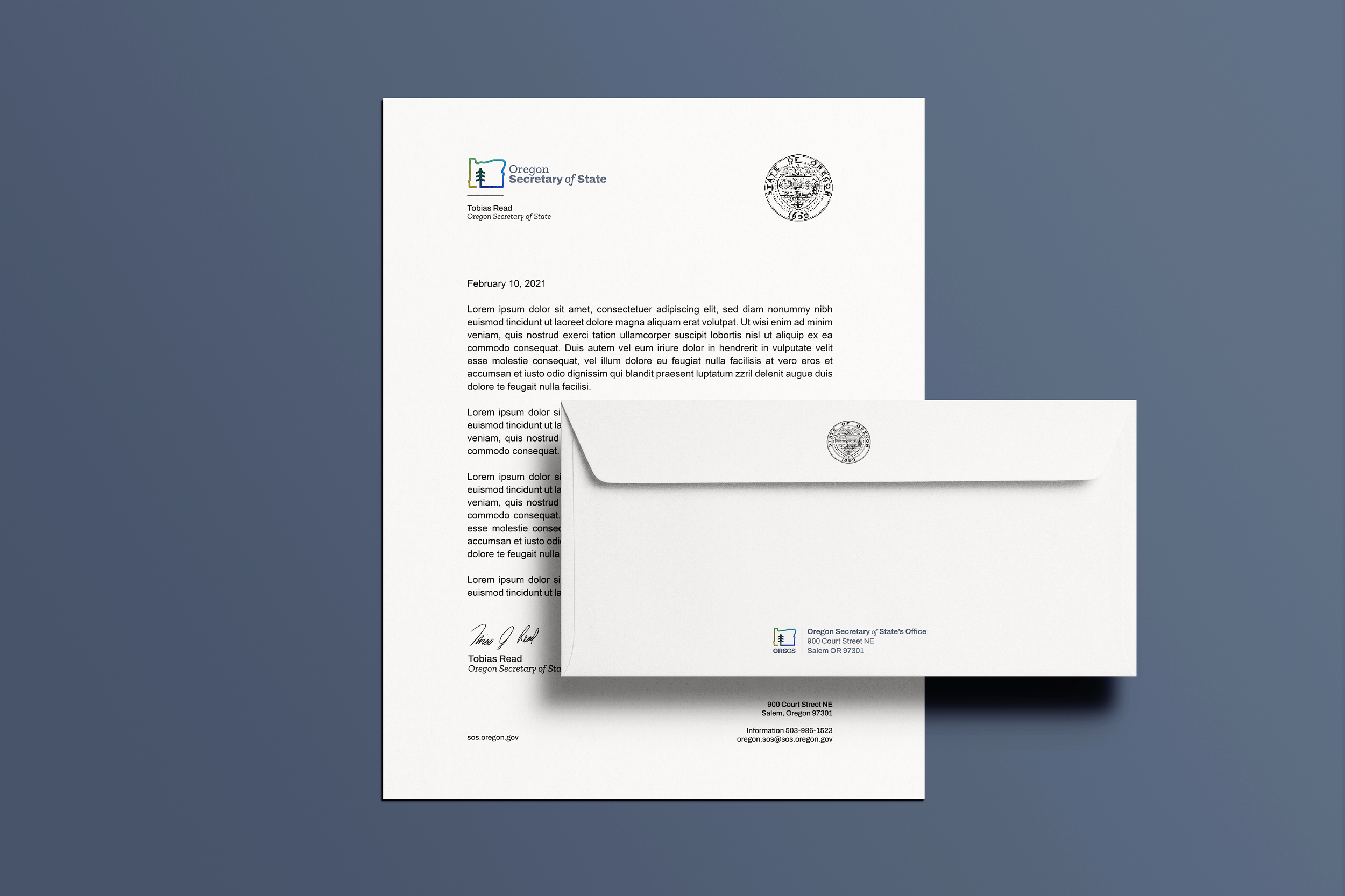
The Oregon Secretary of State’s Office has never had a logo that is distinctive to the agency. It uses the Oregon State Seal, which is used by all Oregon state agencies in some form. But it does not truly have its own specific brand that can unify the agency’s 5 divisions.
Skills Used
Art Direction
Branding
Brand Strategy
UX/UI Design
The Solution
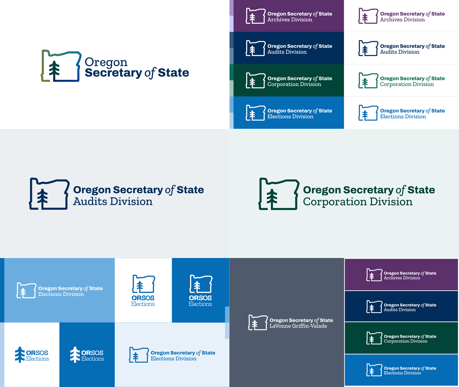
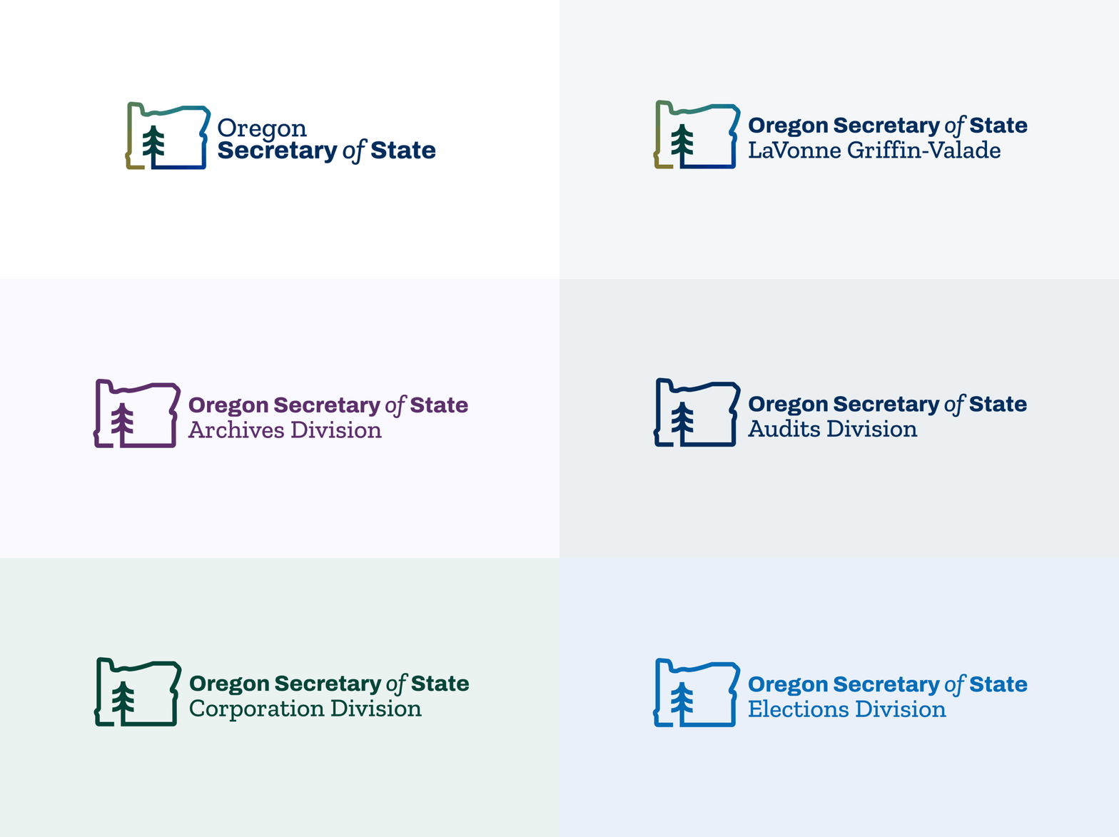
Create a cohesive brand for the Oregon Secretary of State’s office that allows unique brand expression for each division but unifies the divisions so that it is apparent they are part of the Oregon Secretary of State’s office.
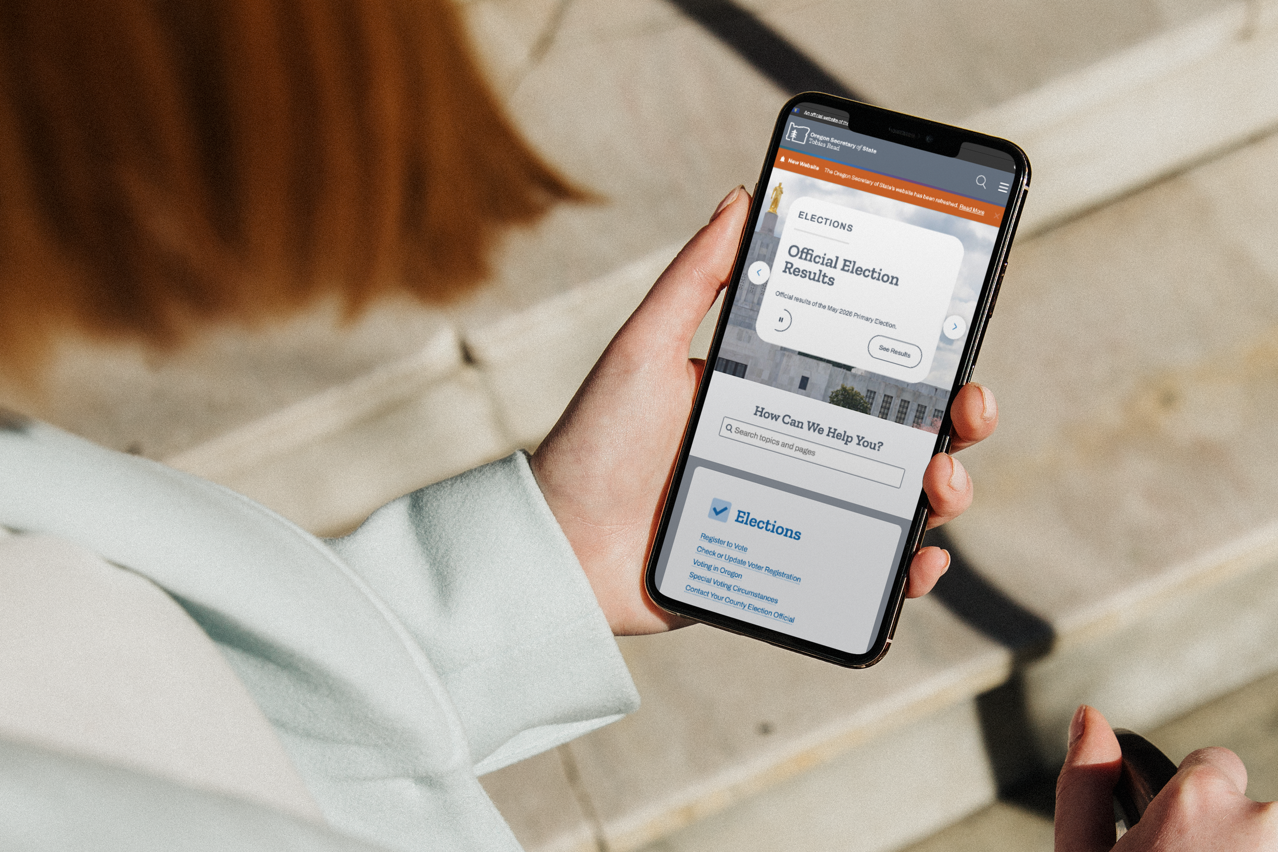
Research Methodology
Qualitative data was used to conduct research for this project. This research included market & competitor research, looking at other Government Offices, other Secretary of State Offices, and local nonprofits in similar segments. We conducted audience surveys, asking a small pool of 50 Oregonians how they felt about the branding. We conducted internal research & surveys, understanding our history, and surveying internal employees about the new brand system as well.
Key Insights
-
“Many Oregonians are unfamiliar
with our state agency.” -
“Many Oregonians don’t know that these divisions belong to our office.”
-
“Our office has a complicated history,
we need to rebuild trust.”
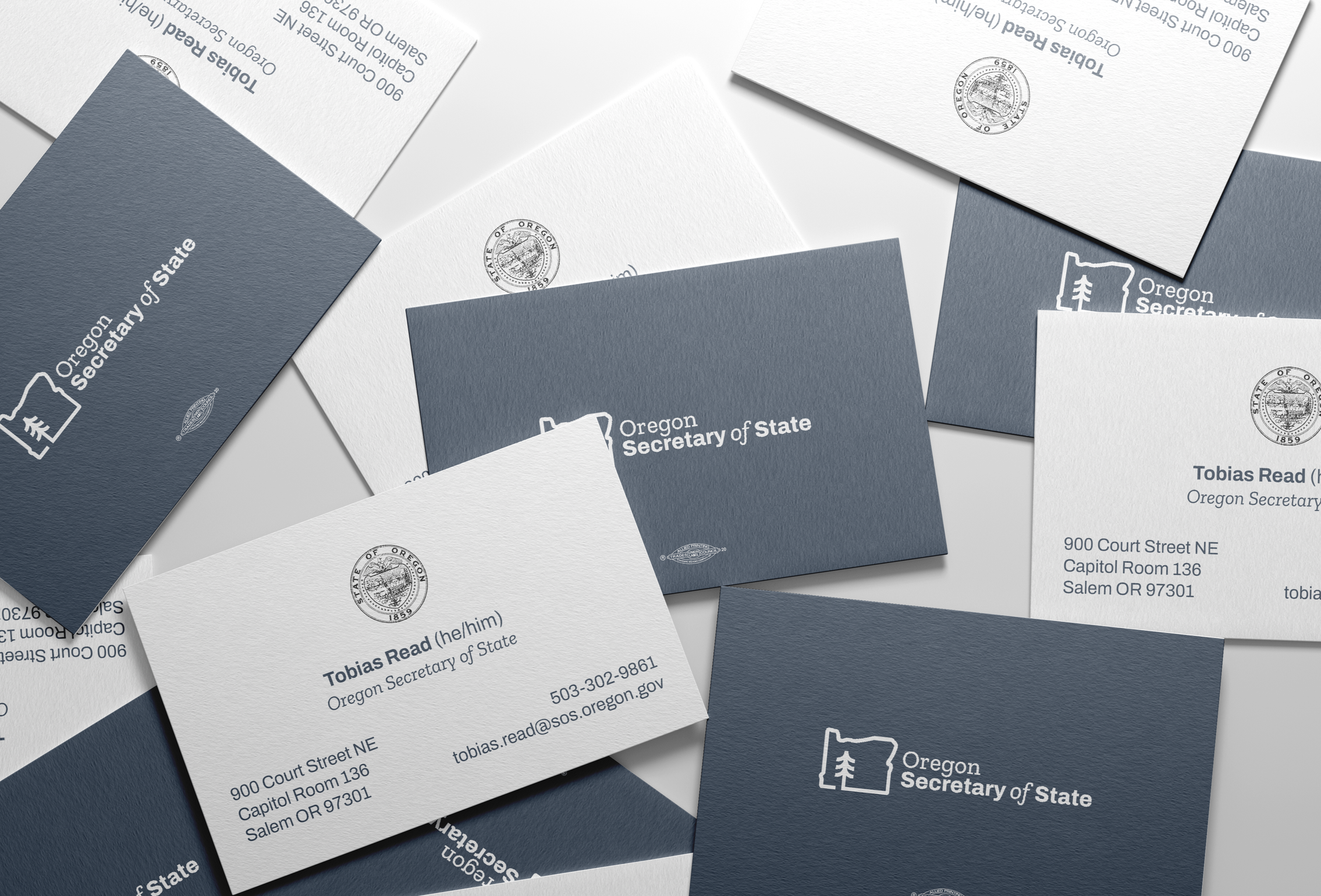
The Results
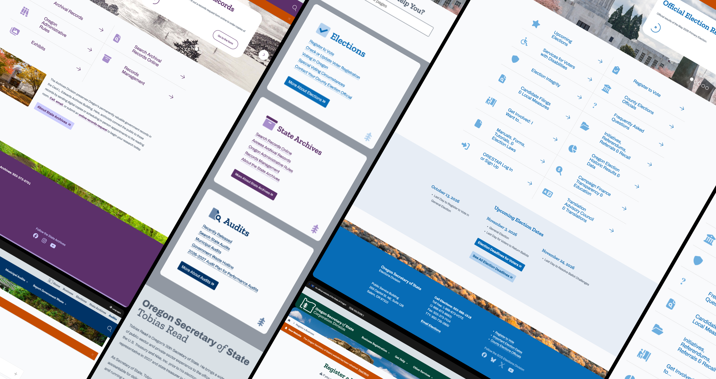
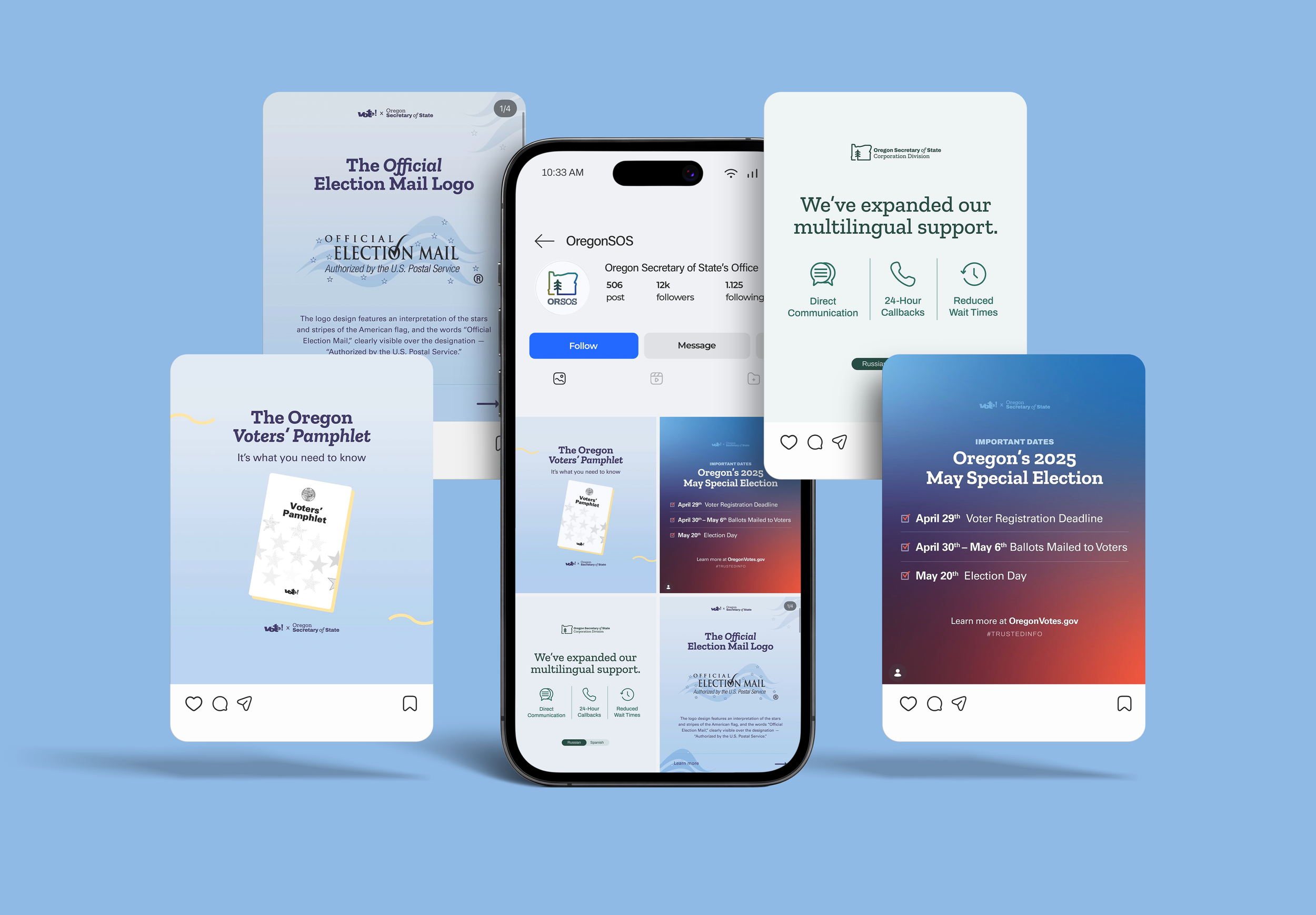
We created a flexible yet accessible agency brand system that unifies the four public-facing divisions of the Oregon Secretary of State’s office under one identity, one that Oregonians from all walks of life and with all needs can trust.
“I love the color change around the border of Oregon landing into a tree sweeping everyone up into unity.”
— Clackamas County Resident, 45-59
“Feels very Oregon and familiar.”
— Marion County Resident, 45-59
“Current. The icon is great,
and creates a modern inviting approach to the SOS.”
— Multnomah County Resident, 45-59