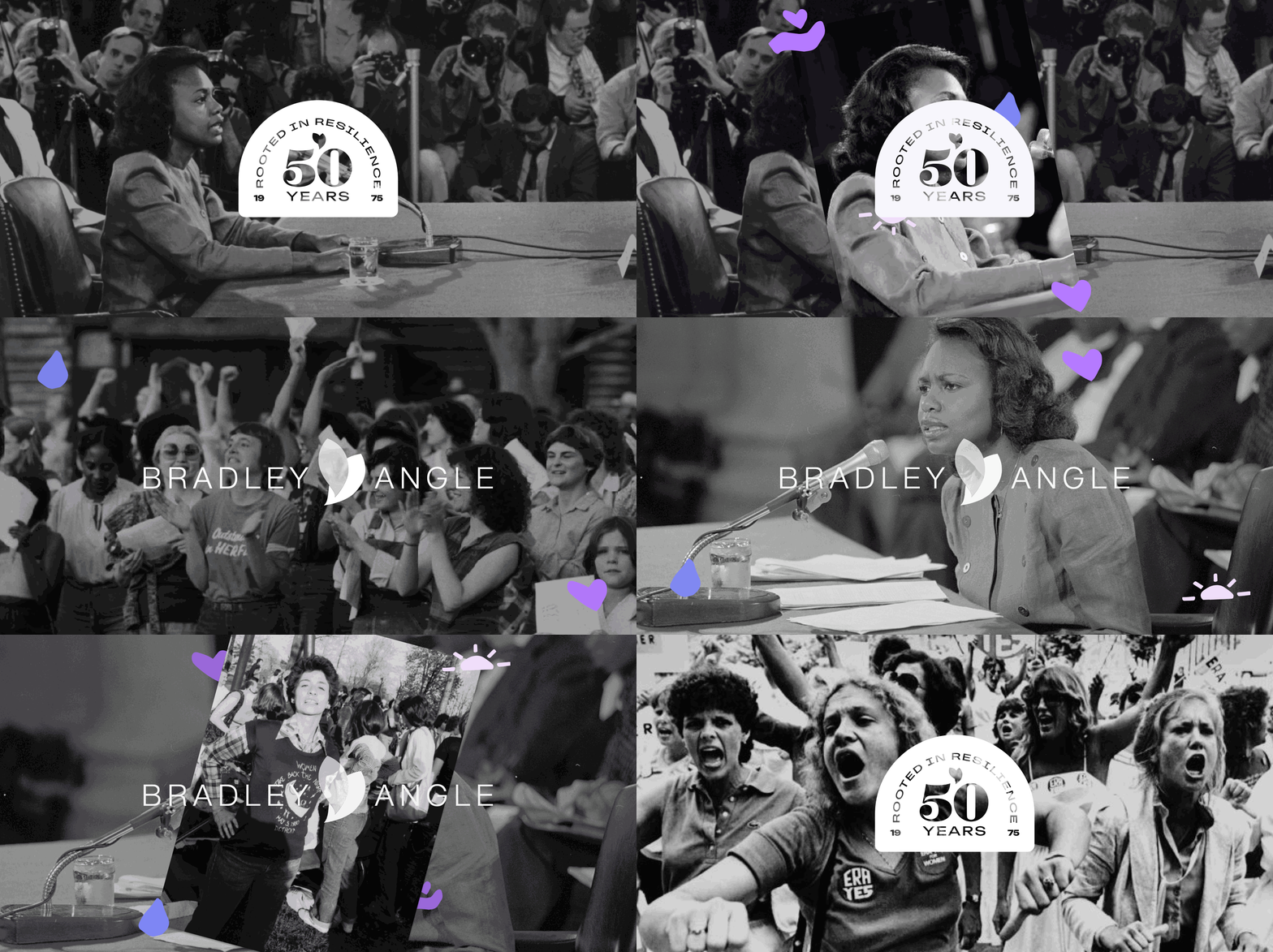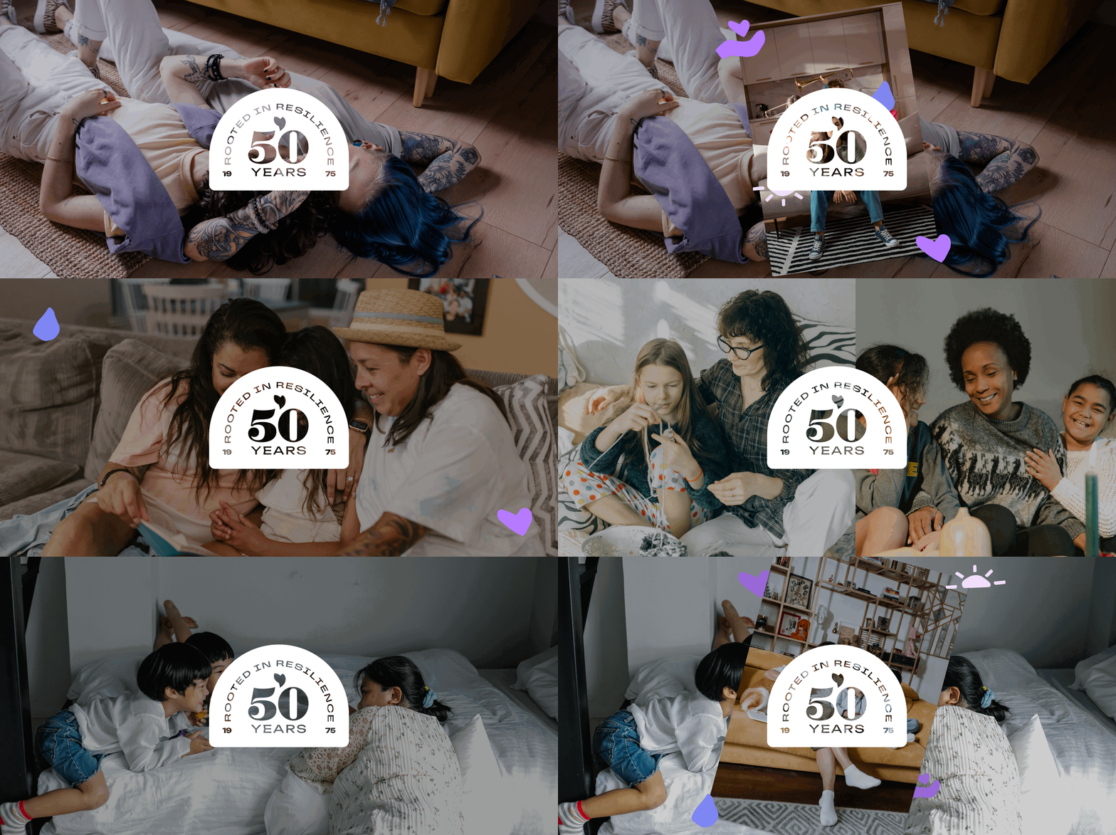
For survivors that need help escaping domestic violence, Bradley Angle is an emergency shelter that provides equitable resources for underserved survivors of all genders and backgrounds to escape domestic violence.

The Brief
Bradley Angle’s current brand centers on the survivor’s journey but lacks a narrative that celebrates their strength, resilience, and life beyond crisis. This gap limits the organization’s ability to fully honor and empower the people it serves. To commemorate 50 years as an organization doing life changing work, Bradley Angle desired a brand refresh with new colors, icons, and patterns.
The Team
Ben Hennes: Creative Director
Kierrah Byrd: Graphic Designer & Strategist
HappyLucky: Copy & Messaging
Skills Used
Branding
Illustration
Strategy
Research Methodology
Qualitative data was used to conduct research for this project. I conducted an in-depth review of the market, researched Bradley Angle's competitors, and watched interviews with their key stakeholders. I found that purple is the color of domestic violence awareness, and many competitors were using it.
Key Quotes
-
“It’s this community, and support. As someone who’s gone through a handful of other organizations, I have not seen the same level of care and compassion.”
-
“It’s like a home. Welcoming, it’s an environment that feels welcoming and safe and supportive.”
-
“It feels full of purpose to be able to support people who are having a tough time … Have safety and feel safe, everyone deserves that.”

The Solution
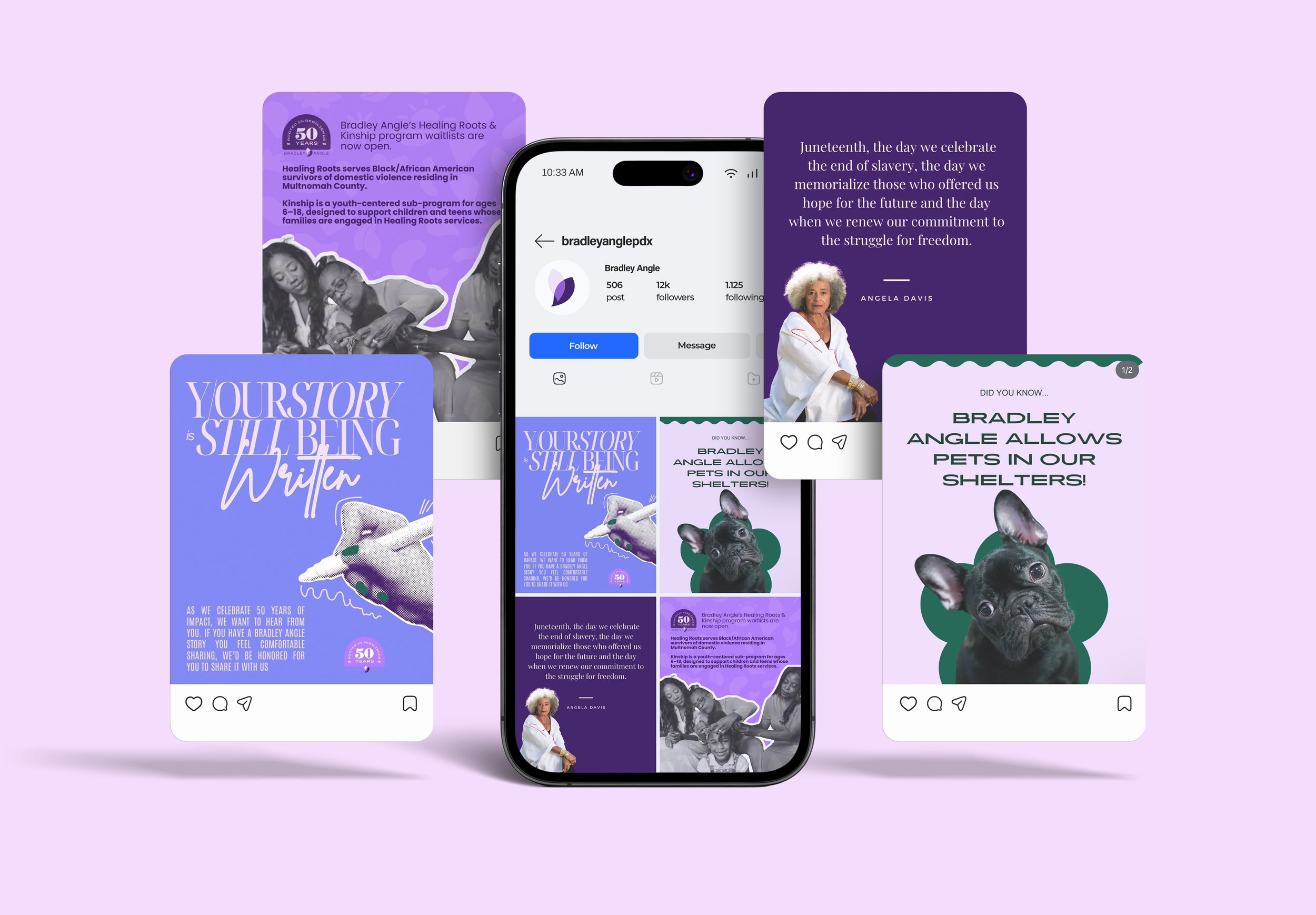
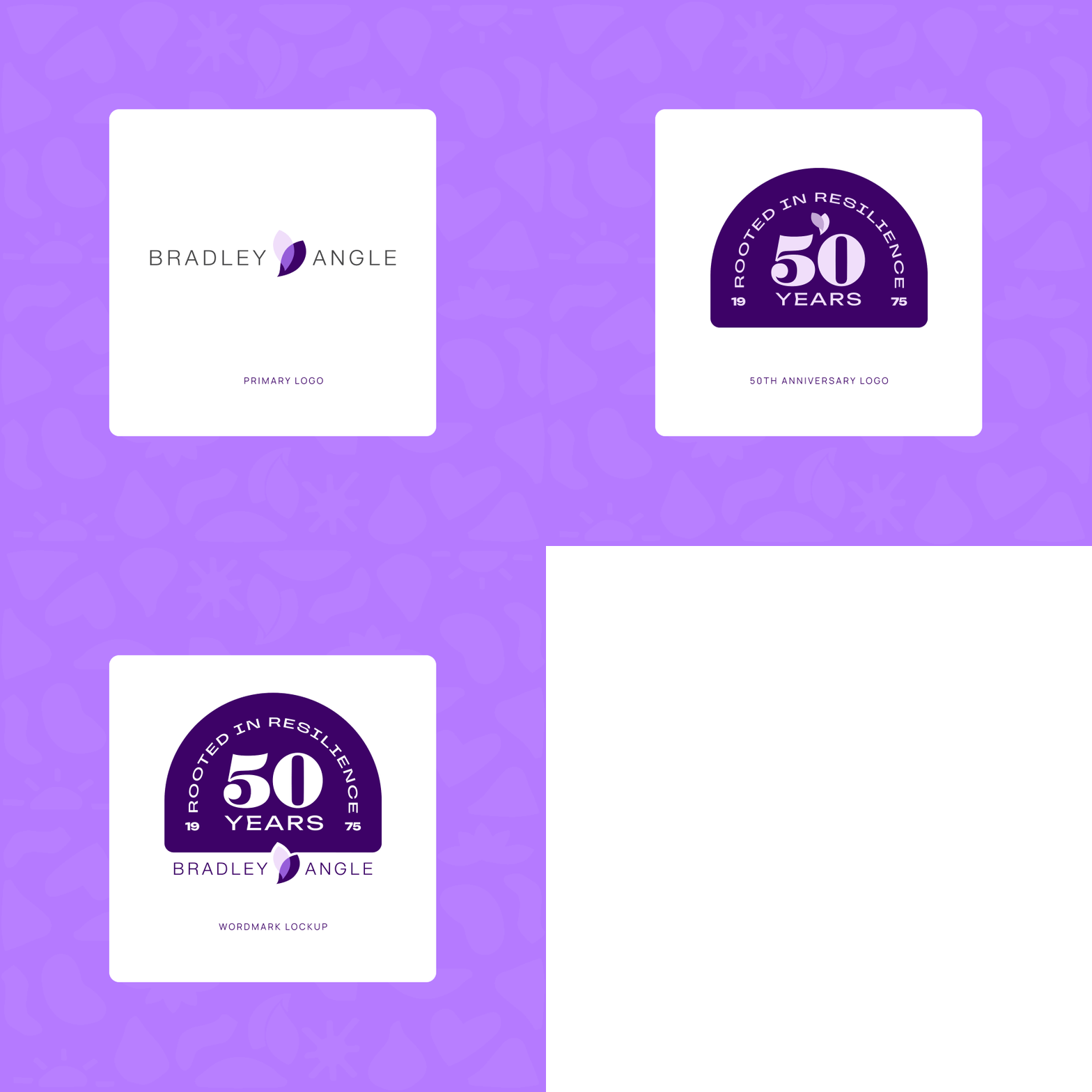
The outcome was a brand refresh true to the mission. We aimed to bring new life and energy into the organization, incorporating bold new colors, icons & patterns, and a fresh 50-year anniversary mark that celebrates survivors.