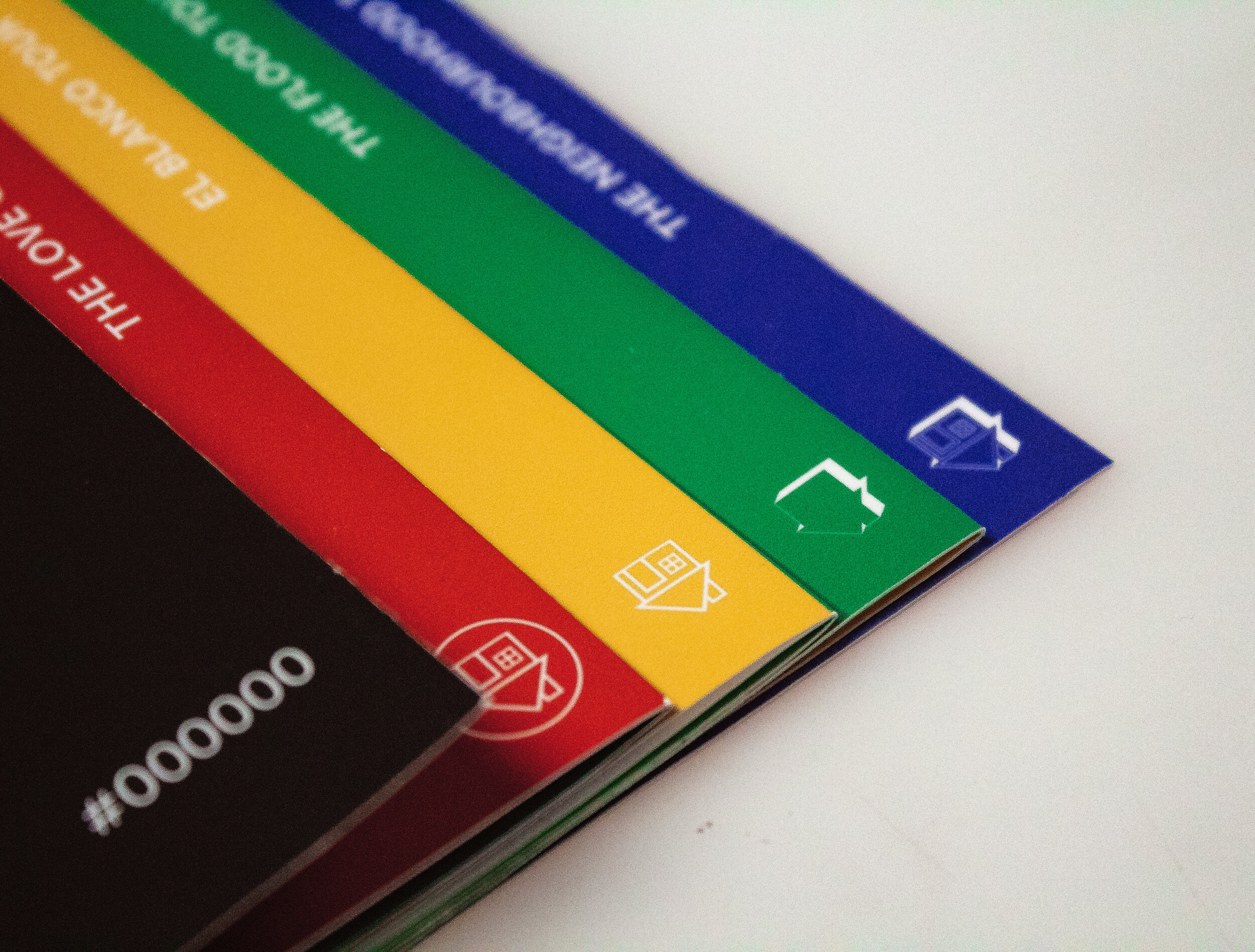
Created for fans of the band, The Neighbourhood, this accordion-fold infographic chronicles the band's evolution over a four year concert period.


The Brief
Create a timeline with four levels of information. With 3 visualizations based on a timescale, and one supplemental (non time dependent) dataset, or narrative building element.
Skills
Art Direction
Data Visualization
Print
Illustration
Year & Timeline
2018, 5 weeks


Over the course of 2 weeks I:
Watched 4 concert videos from 4 different tours totaling to 6 hours
Noted each song and ad-lib during performances
Rated each crowd reaction to each song out of 11
Made note of each tour's opening acts
Took note of the progression of the band's logo
Examined the cities the band toured and the amount of people who went
Took note of how the band's appearance changed throughout the 4 tours